Positioning a London heritage furniture retailer
Heal’s
Where Design Lives
The iconic British furniture retailer Heal’s was losing ground to online pretenders. We created a new branding system, tone of voice and visual identity to enable them to reclaim their legacy and market position. We worked closely with Heal’s to understand their business goals, heritage, and the challenges they face in an extremely competitive market. The brand’s DNA was deciphered and distilled, and a series of consumer messages were born out of the positioning statement of ‘Where Design Lives’.
IMPACT
- Rebrand drove major business shifts, highlighted by the 2023 flagship store transformation
- Refined Heal’s aesthetic and identity, strengthening competitive differentiation
- Revitalised customer engagement
SERVICES
Brand Strategy
Brand Positioning
Brand Identity
Creative Direction
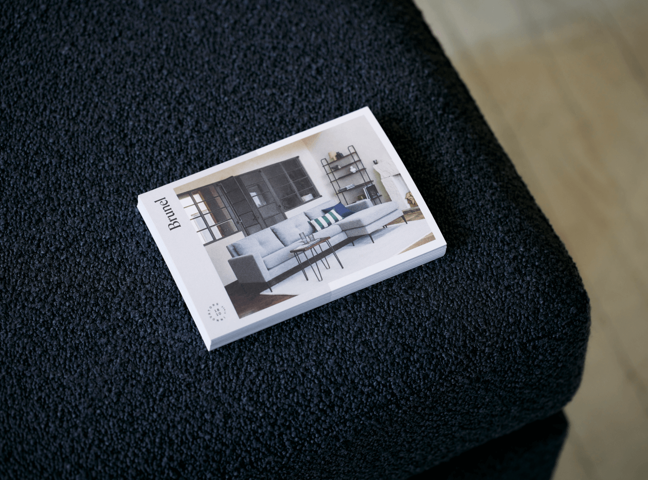
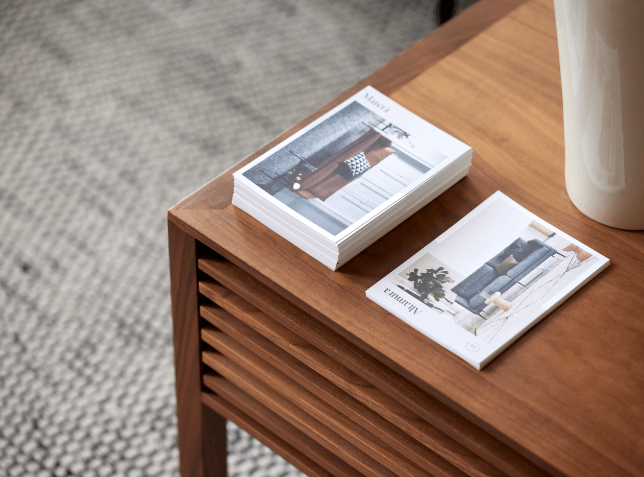
Design for Print
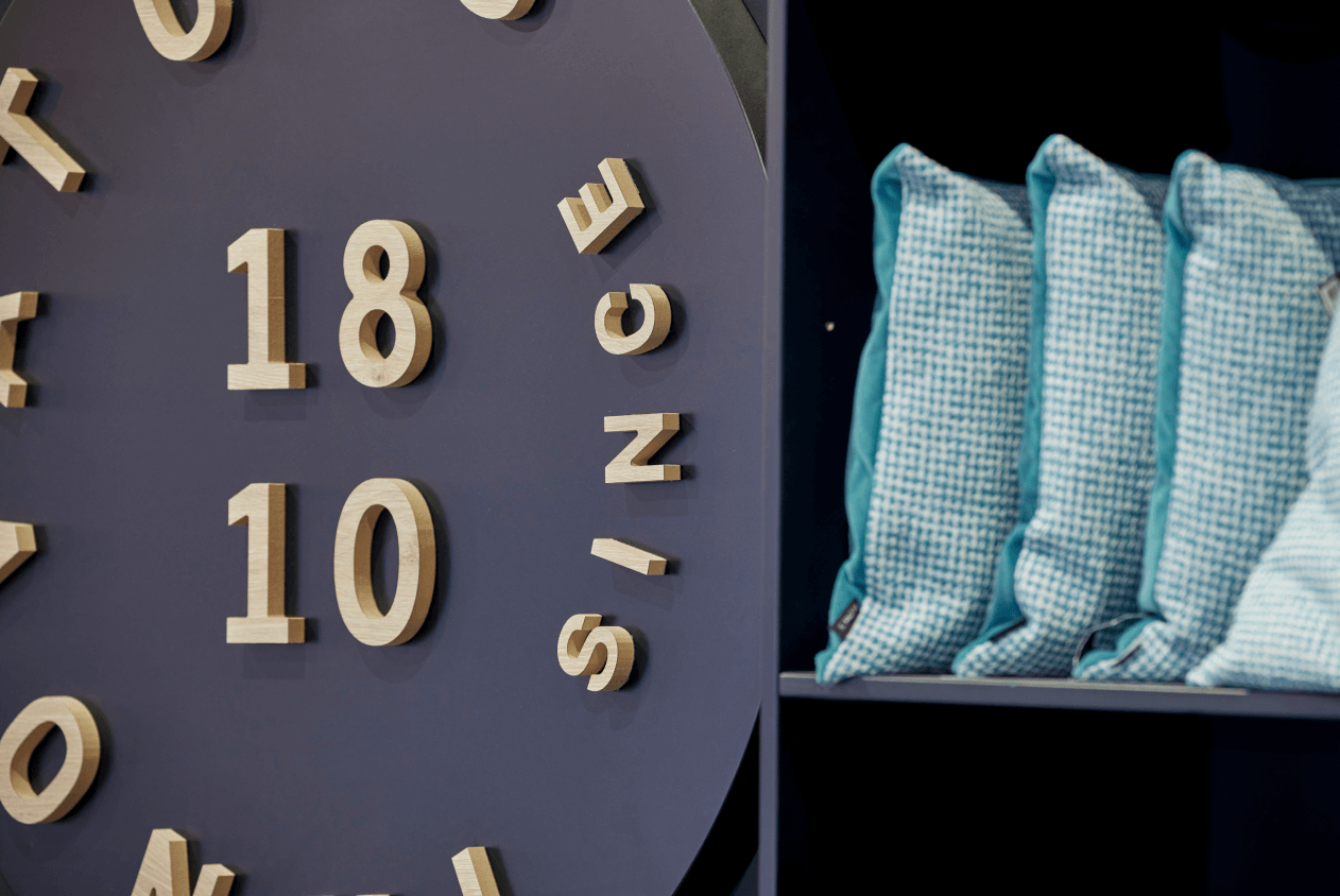
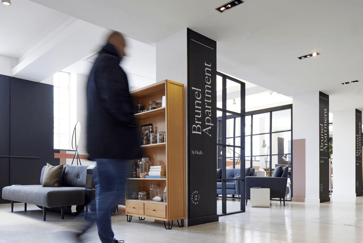
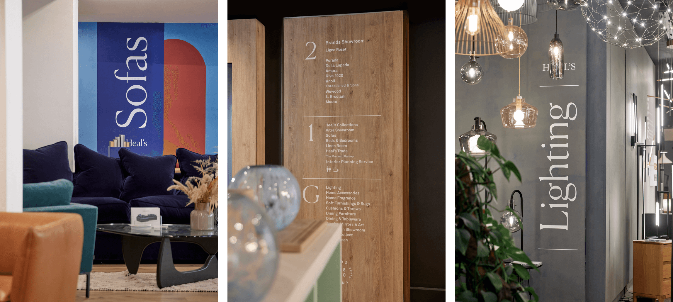
Wayfinding / Signage
Photo Art Direction

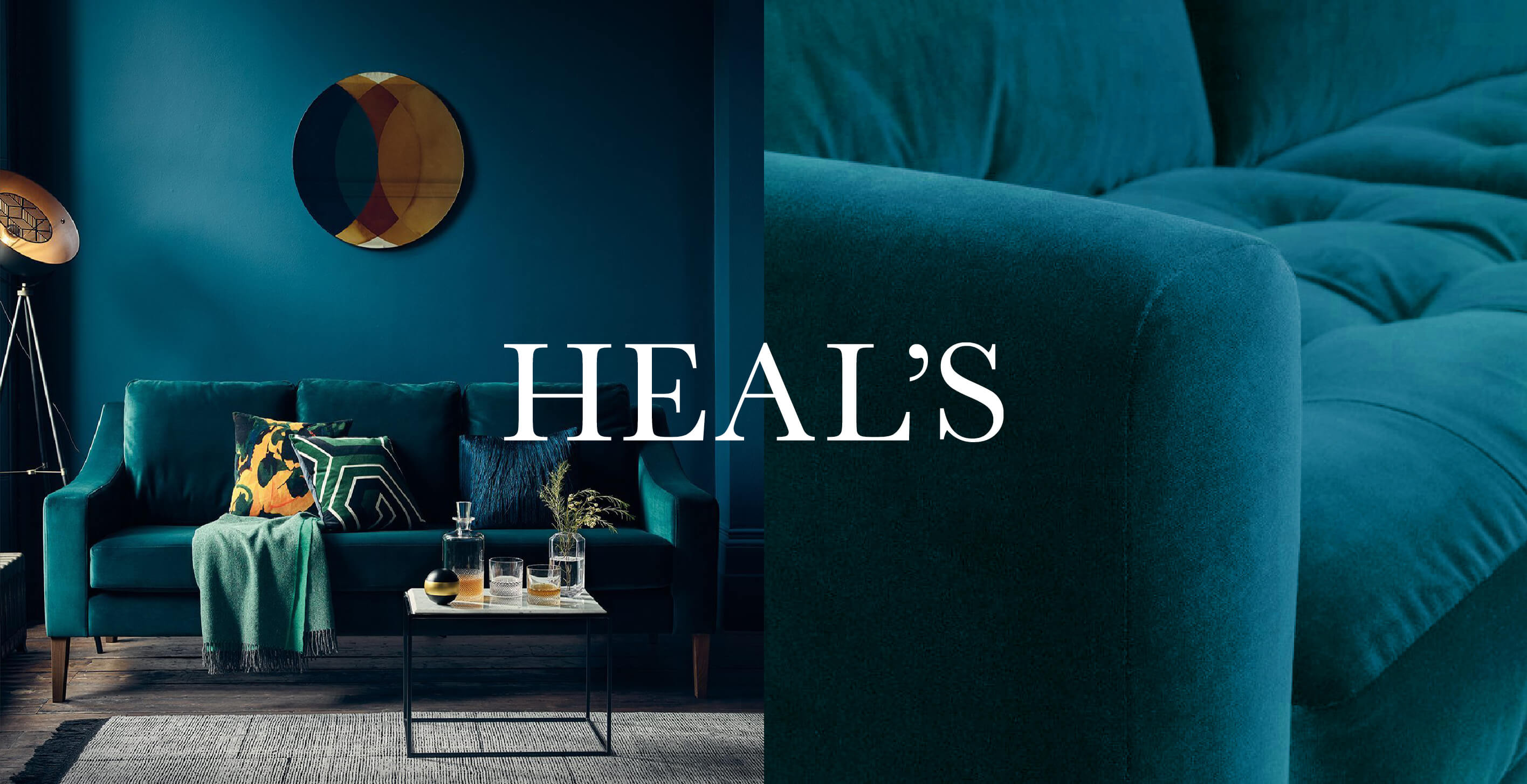
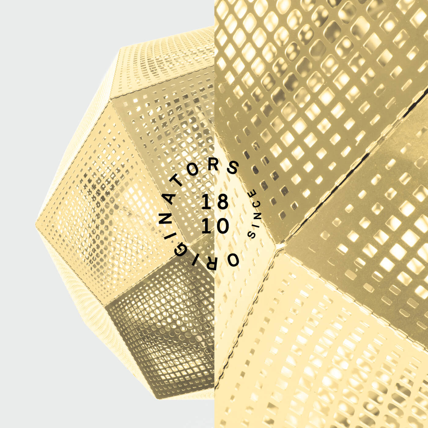
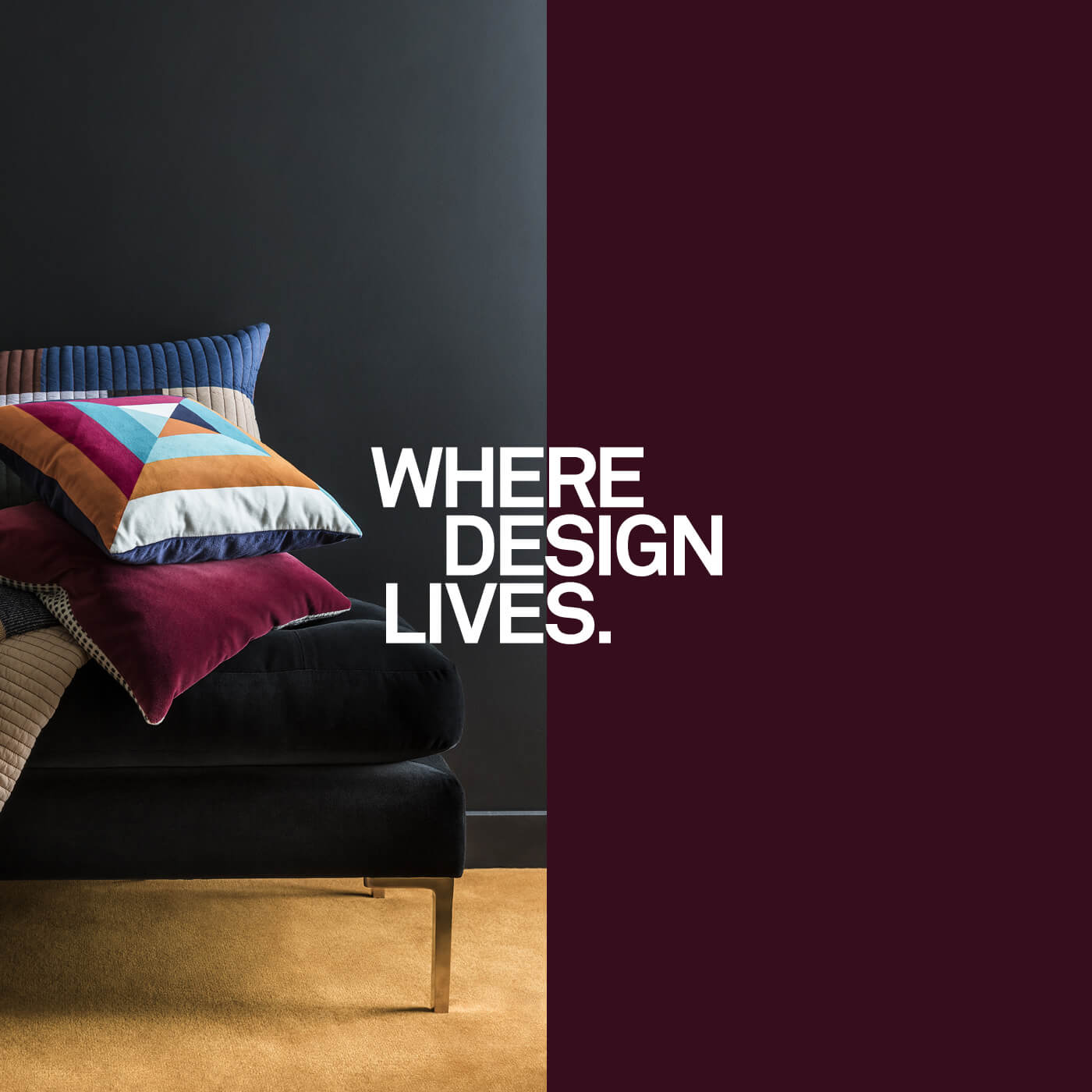
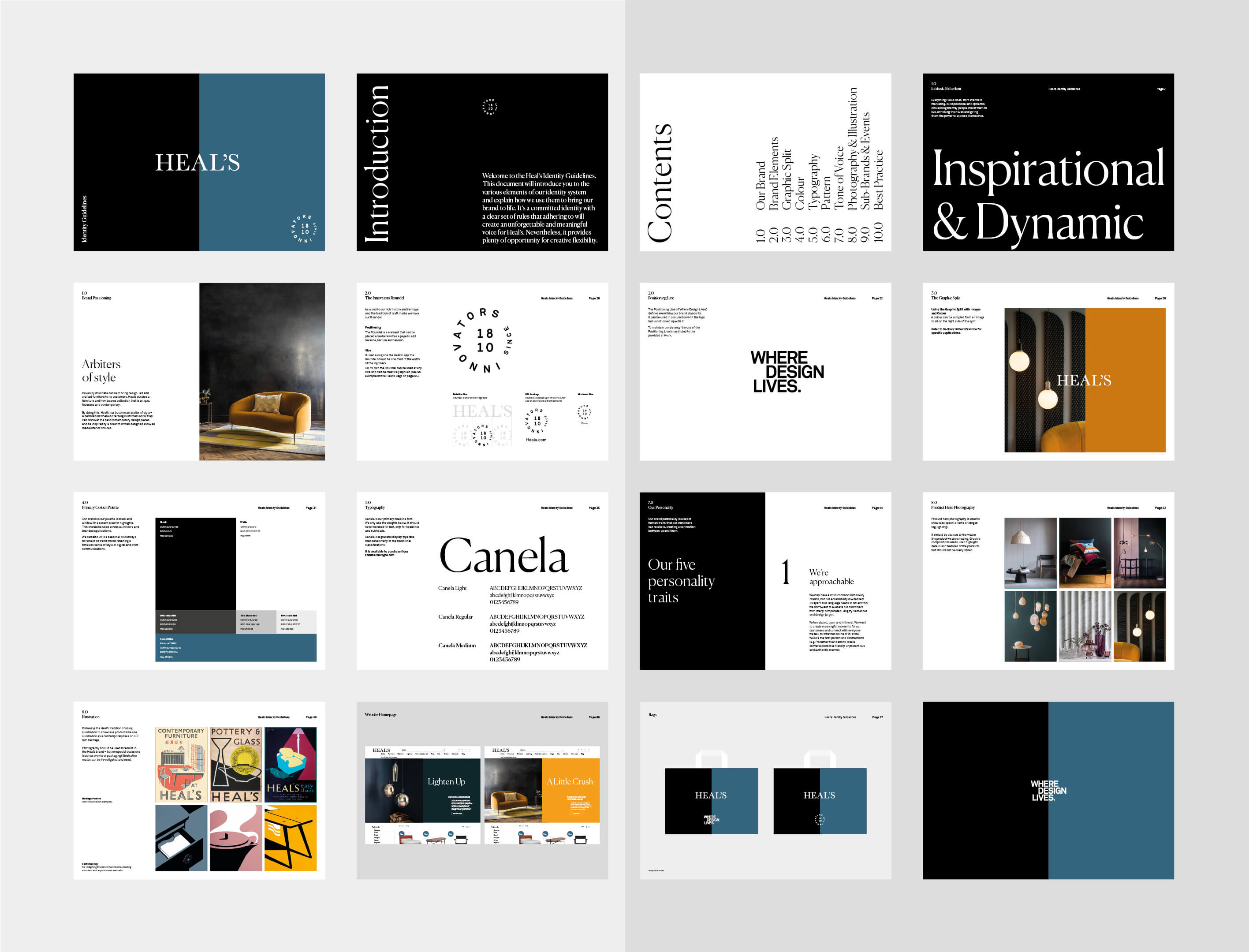
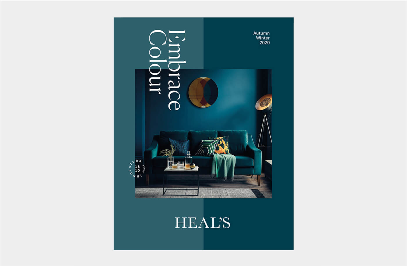
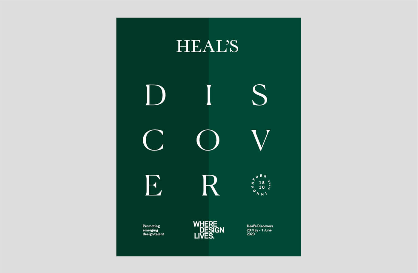
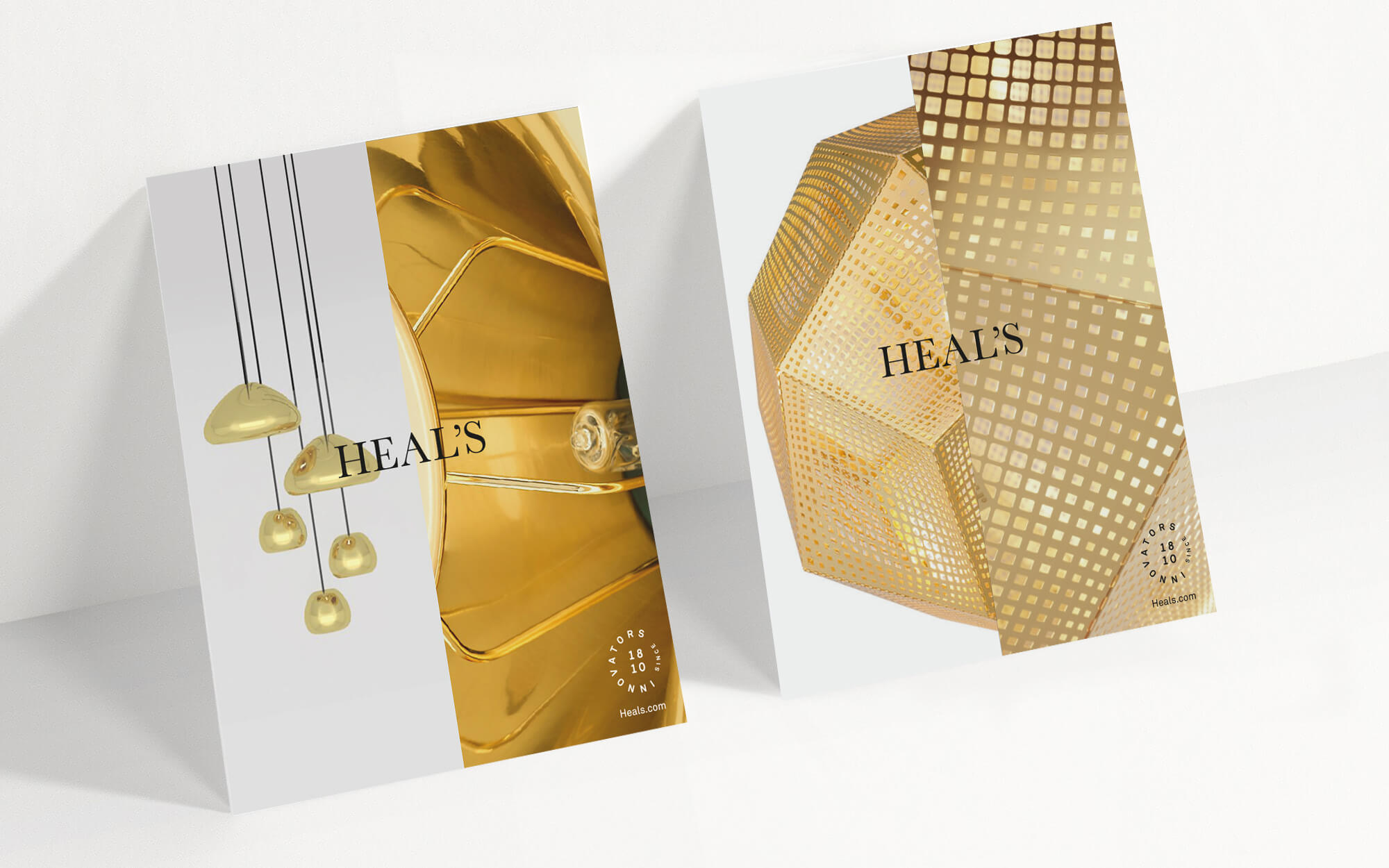
THE GRAPHIC SPLIT
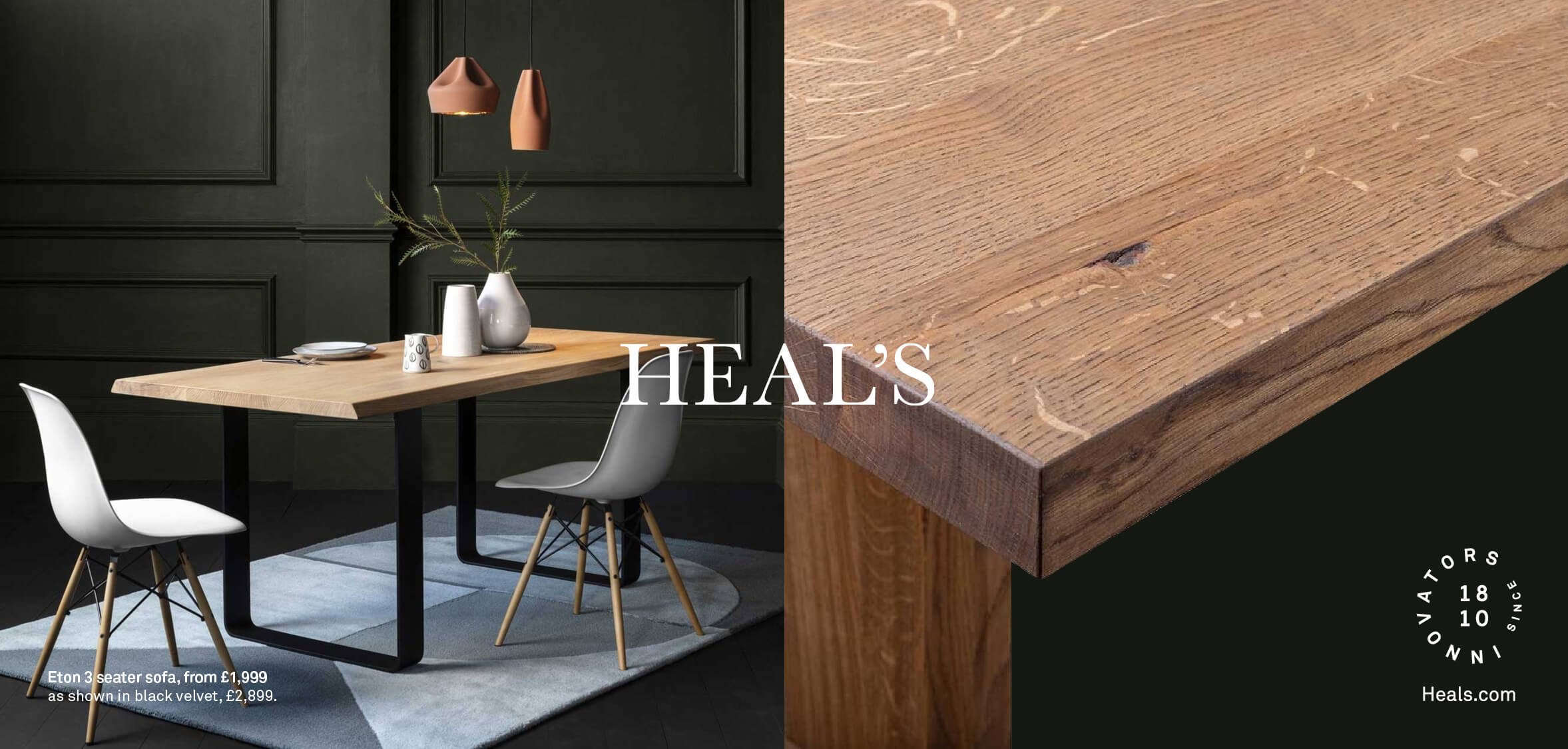
A ‘split’ was developed as a key graphic to increase recognition and allow flexibility and creativity across all creative outputs.

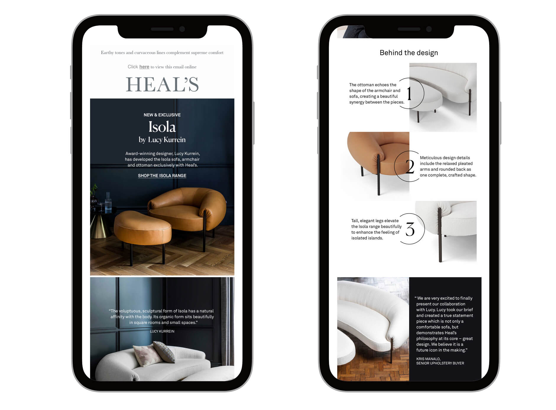
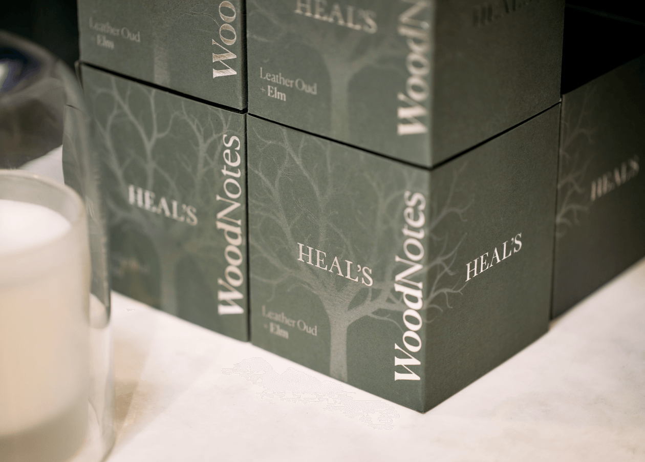
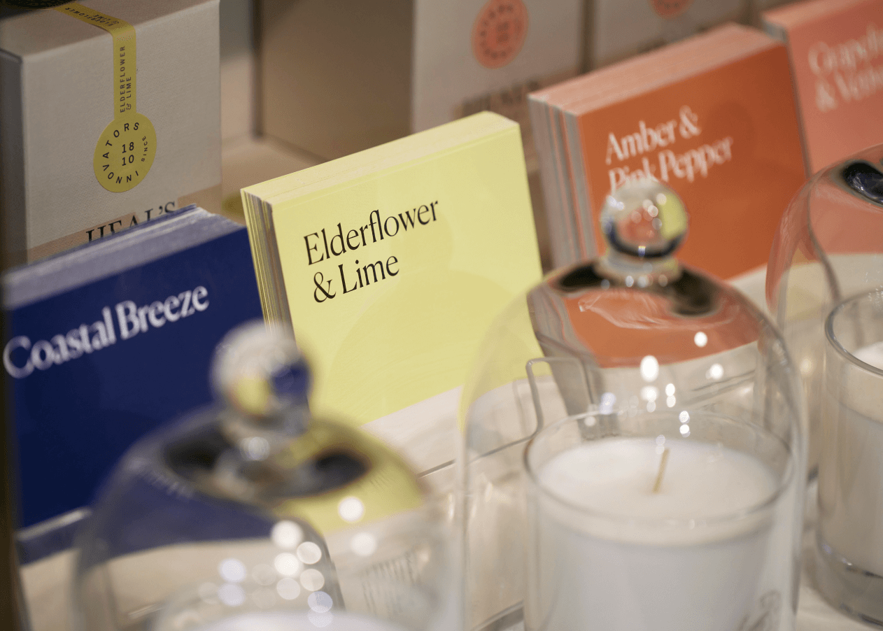
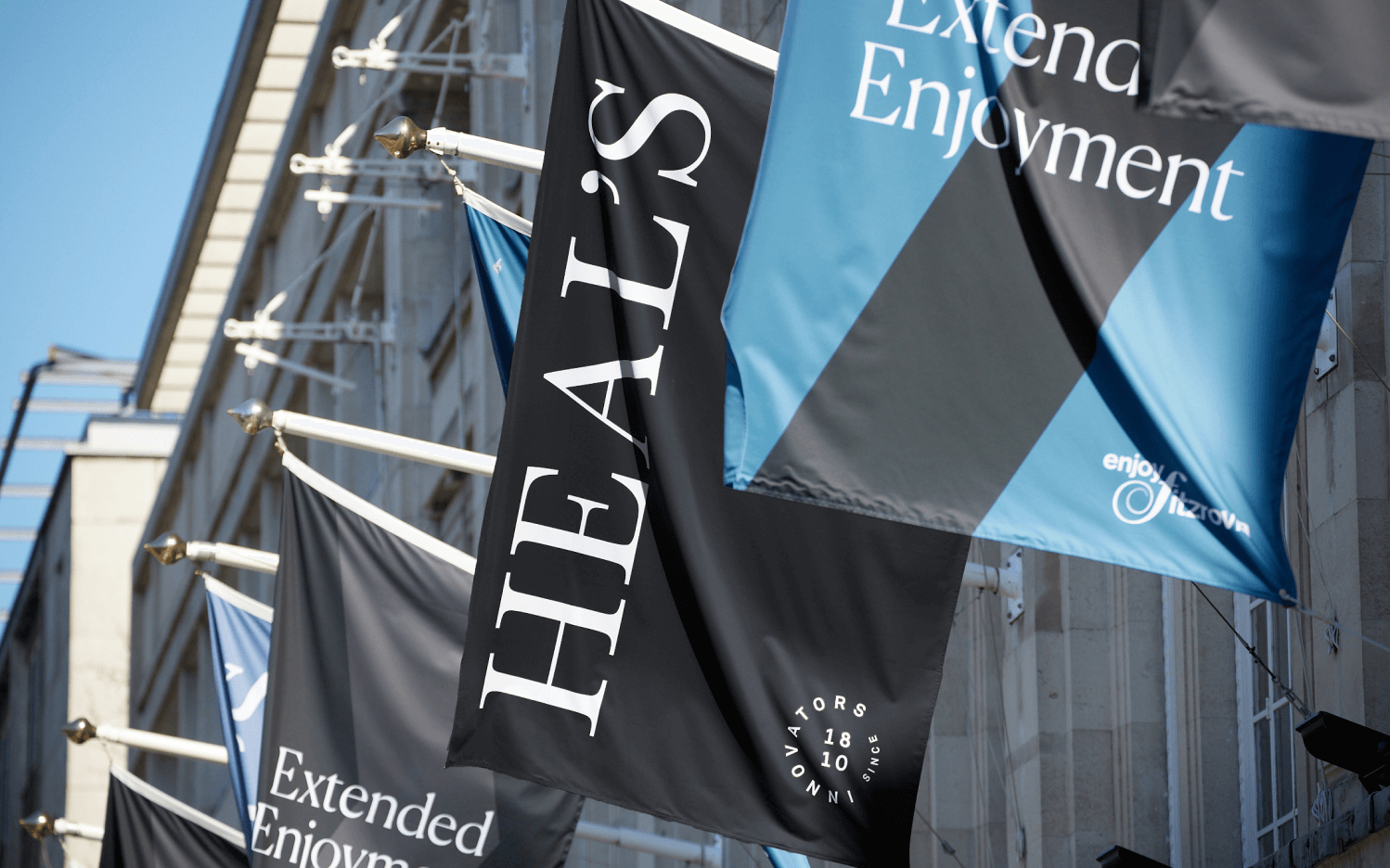
The logo remained unchanged whilst developing a new roundel, a more expressive tone of voice, a new graphic language, a rich interiors-led colour palette and a graceful modern typographic style inspired by Heal’s past.
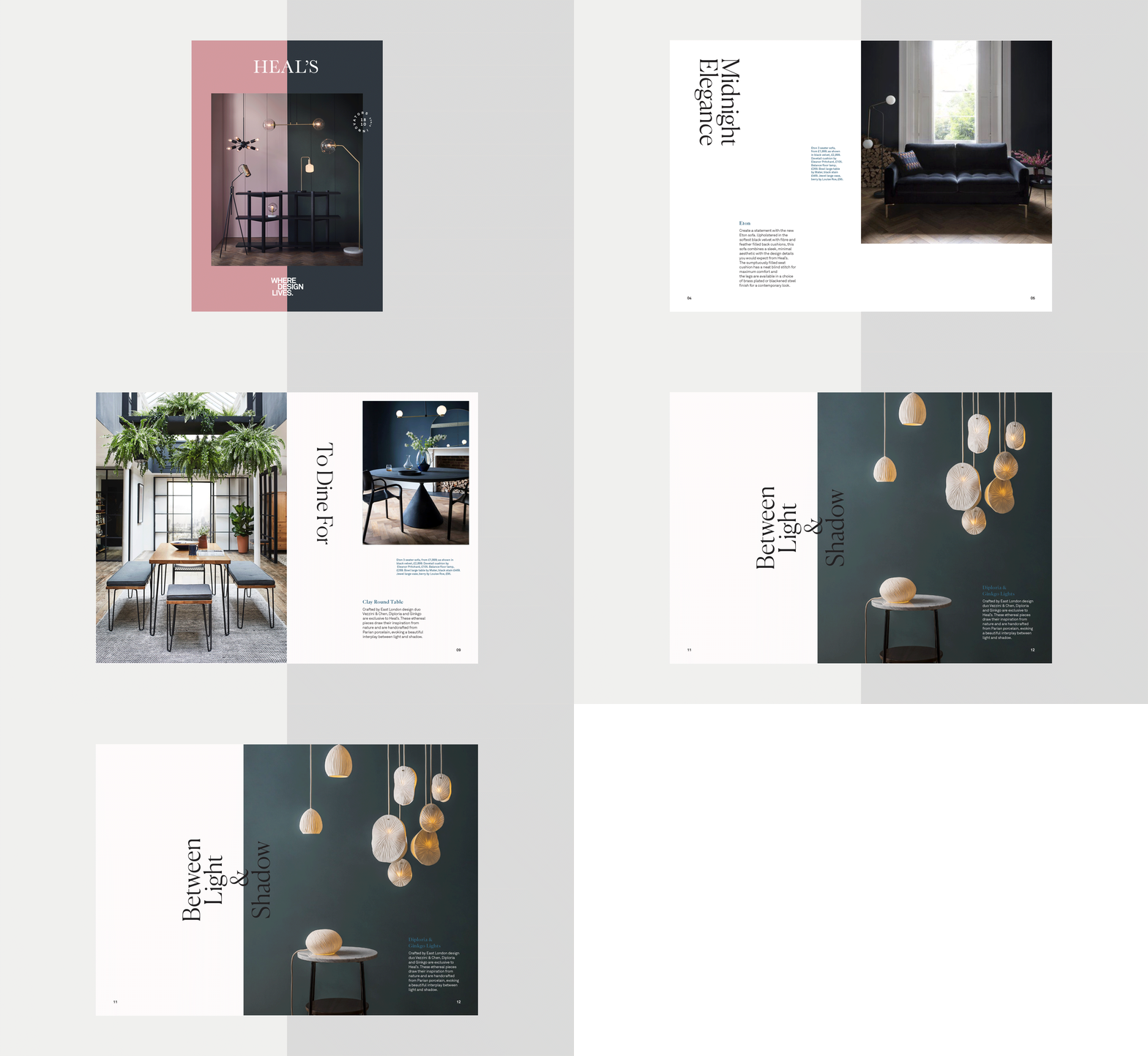
THE GUIDELINES
An extensive brand book was developed that allowed us to explore the versatility of the design language and messaging, to set photographic guidelines and rules for the brand in-store and across digital. The design team at Heal’s now use the brand guidelines and are applying them throughout stores, marketing and digital applications.
